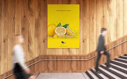
For our readers who aren’t professional designers here are some tips to create effective poster designs. Poster printing is one of the most effective methods of print marketing for raising awareness and promoting your business in your local area, at networking events and at exhibitions. Posters are a great way of attracting attention and can be seen by many people in a short space of time, depending where they are placed. For example, if placed in a town centre or at a bus stop your poster could be seen by hundreds of people a day.
To maximise the opportunity of marketing your business through poster printing it is imperative that your posters are well designed, communicate your key messages and are eye catching. In order to make your poster design aesthetically pleasing there are four key areas to consider when designing your poster; colour, imagery, composition and text.
Colour in poster designs
It comes as no surprise that bright and bold colours are the most eye-catching colours you can use in poster design and dull and dark colours can be harder to see and may blend into the background. The best colours to use for eye catching poster design are warm hues such as red, orange and yellow – these colours are the most effective at drawing attention and can make objects seem visually larger and closer.
It is also important to consider your brand guidelines when designing your poster to try and incorporate your brand colours where possible. Also, think about your company logo and how this along with your chosen poster colour scheme will work together. Speak to your print designer about incorporating bright colours alongside your brand colours to find a combination that is on brand and stands out.
Imagery in poster designs
As with all print marketing, high quality imagery can make your poster design stand out and increase engagement with your poster. Using large images will help your poster be seen from further away and could drive interest in your poster. Ensure that your chosen imagery is in line with your brand guidelines and is relevant to the message of your poster. A bold image is likely to capture more interest than a subtle image.
Composition in poster designs
The composition of your poster is one of the most important factors of poster design. It is imperative that your poster can be interpreted at a glance, that your image is prominent and text is well placed and easy to read. If your poster is hard to understand viewers are unlikely to become engaged and will quickly walk past your poster.
While imagery is important in poster design, you should keep visual clutter to a minimum to avoid over complicating your poster design. It is thought that symmetrical design is more visually appealing to viewers, so where possible try to make your poster design as symmetrical as possible.
Text in poster designs
The text on your poster should be short, concise and catchy – above all else it should communicate your key messages. If the text on your poster can be read in a couple of seconds, viewers are more likely to read it as they walk pass and if they are interested in what they read they are likely to stop or come back to your poster for another read or to note your website address to find out more.
Lemon Press has a 3,000 sq.m print production facility in Redditch. Our printing premises have been extended and are equipped to suit our growing needs, enabling us to invest in a long and stable future. We run our factory around the clock to ensure we offer unbeatable service.
Whatever your print requirements, the Lemon Press can promise the same high levels of attention and professional care for every job placed with us. Get in touch on 01527 510262 or email info@nulllemonpress.co.uk


