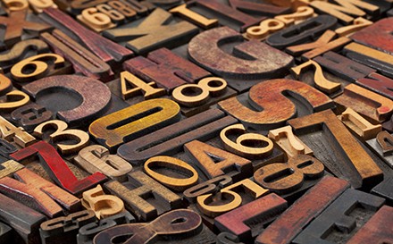
The Importance of Typography in Print it is often overlooked. Typography is extremely important in printed marketing materials, whether a leaflet or a poster, your printed marketing materials have to be reader friendly. This makes the art of typography imperative to make your words comes to life. It impacts how it is received by the reader and good typography can convey feelings, reinforce brand image and speak to the reader. It is as important as the colours and the imagery used on your printed materials and should be given the attention it deserves.
Evoke feelings and emotions
Good typography enhances your graphic designs and gives them the ability to evoke the right emotion. Your typographical choices can have a great influence on your audience and can even change the way your message is perceived. Typography can not only evoke feelings and emotions about the message but also about your brand, whether we are aware of it or not we all make judgments based on how a brand looks and how it makes us feel.
Reduce eye fatigue
When designing your printed materials, you are aiming to impress, typography helps you achieve that. Choosing the appropriate font can make your message more legible and easy to grasp. The line length, font size, character rendering and other typographical elements must be considered to achieve the best results. Good typography can help reduce eye strain and fatigue and encourage the reader to pay more attention to your printed materials.
Communicate clear messages
Good design can create a lasting first impression and can boost your credibility and trustworthiness. Good typography can help you communicate your messages more clearly and can help guide your readers to taking the desired call to action. Typography can be used to highlight key points of important information and can grab your reader’s attention. It is important to choose a font that is appropriate for your message. For example, printed materials for a professional service is unlikely to feature comic sans font.
Main types of font
There are literally hundreds if not thousands of different fonts to choose from and choosing the wrong one can have a massive impact on the look and feel of your marketing materials. Let’s take a look at some of the more widely known and used fonts.
Serif
Serif is the slight projection at the end of a stroke that’s most commonly seen at the bottom of letters. Some serif fonts such as times new roman will have what look like little feet on them and this is what makes them serif. Serif is often regarded as one of the easiest fonts for the eye to read and is generally used to help convey authority and trust.
Sans Serif
Sans serif fonts have no feet or serif and are often perceived to give a modern and streamlined feel but can be harder to read in smaller sizes. Sans serif fonts are often used to evoke emotions such as simplicity, luxury and exclusivity which is probably why brands such as Apple use sans serif fonts throughout their marketing.
Script
This font type is known for its elegant, light and professional appeal and is often used by traditional and professional companies. This font is intended to be used sparingly and would not be appealing if used as body copy or in small sizes.
Hand Lettering
These types of fonts have the appearance of being hand written, often in a childlike or note style. Hand lettering fonts are perfect for adding a human element to the design to help the reader relate to the message.
If you have any queries or would like to discuss your next print project, call us on 01527 510262 or email info@nulllemonpress.co.uk


