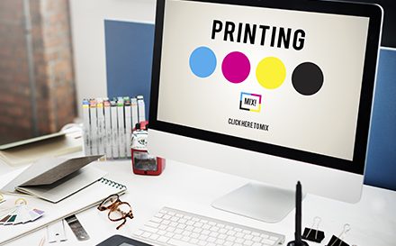
What are the common mistakes when designing for Print? Designing for print is very different to designing for web and, although they both have the same objective of conveying a message and encouraging the reader to make the desired call to action, they have a very different process.
Here at Lemon Press we always recommend that you enlist the services of a good graphic designer when it comes to your print marketing. This ensures that your printed materials are professionally designed and evoke the right emotion and desire in your recipients.
If you are thinking of creating your own artwork, updating artwork you have used in previous campaigns or just want to learn more, we’ve put together a handy guide highlighting three of the most common mistakes when designing for print.
Avoid these mistakes when designing for print
1. Using Low Res Images
If you use low resolution images in your print design the images will pixelate when printed at full size. While it may look fine on your computer screen, once printed the low quality of the image will be easily detected. It will have a huge (detrimental) impact on the overall quality of your printed materials.
The main aim of your printed marketing materials is to give your recipients a feel for your company. Nothing will turn them off quicker than pixelated images, meaning that your marketing efforts and budget have gone to waste. If your printed marketing materials look low quality because of low resolution images it will portray that your company is of low quality.
If you do not have the time, budget or available skill set to arrange a photoshoot for your marketing campaign, there are other options. There are a variety of reputable stock image websites that let you purchase and download images for your marketing materials. Speak to your printer and designer to get their recommendations. They should be quite familiar with stock image sites and remember it is better to use a high quality stock image than a low quality original image.
2. Forgetting about the Bleed Area
The bleed area is commonly forgotten when the design is created by someone who is not used to designing for print. The bleed area is the area of artwork that is extended beyond the dimensions of the document. It is used to avoid strips of white paper showing on the edges of your printed materials after trimming.
Any objects in your artwork that touch the edges of the document require bleed. For instance, a background colour or image should spread to cover the entire bleed area as should any objects that creep in from the side of the page. In the UK, a bleed of 3mm is commonly required. This 3mm accounts for each of the four sides of the page; therefore, you should add 6mm to the width and height of the document.
3. Saving Files Incorrectly
When saving files for print design it is a good rule of thumb to save the files in CMYK and at 300 dpi at actual size. This ensures that your commercial print partner will be able to print your artwork. If not saved correctly it can cause unnecessary hassle and delays for you, your designer and your commercial printer.
CMYK is easier to manipulate and tweak than RGB as it is viewed the same way by everyone. Whereas RGB absorbs light, CMYK reflects light; how the pigment appears will depend on how it reflects light. CMYK is best suited to materials that will be professionally printed such as brochures, leaflets, flyers and posters.
If you would like to discuss your printing requirements, please contact us on 01527 510262 or email info@nulllemonpress.co.uk


